


At Yoghurt Digital, we look at a lot of client websites, and visual clutter is almost always the first issue we see when reviewing a site for the first time. Often, it only takes us 3 seconds to notice this issue, so undoubtedly it doesn’t take much longer for users to notice it too. According to research by Nielsen Norman Group, users judge the credibility of a site in fewer than 5 seconds and often leave a web page in 10-20 seconds.
You might be asking, “How can people read an entire webpage in just 20 seconds?” The answer is: they don’t. The typical user scans a website for effective visual cues such as headlines, bullet points, and graphics to find the information they want. If they don’t find this information within 10-20 seconds, they’ll leave the page – it’s as simple as that.
To prevent this from happening to you, we’ve put together our top three design tips for visually decluttering your site. From creating structure to keeping it minimal, read on to learn how to help your users find the information they want on your site more quickly and easily.
1. Visually structure your content
Having good content is just part of the battle. If it’s unstructured (particularly if there’s a lot of it), users aren’t going to want to read it. Instead of filling the page with lengthy copy and expecting users to dig out the useful information themselves, you need to direct them to exactly where to look. This is easier said than done, but can be achieved by following a few simple visual design tips:
- Delete irrelevant content and make sure all copy is succinct and easy to understand.
- Prioritise content and highlight the most important content with changes in size and colour.
- Chunk information into small sections and bulleted lists.
- Use icons as visual anchors.
- Use visuals to enhance the message.
- Leave generous whitespace between different elements, especially between each section.
- Show and hide content with accordions or tabs.


2. Avoid using too many font styles
It can be very tempting to have many different, nicely designed fonts on your site to attract attention and make things look more creative. But avoid the temptation! Generally, using more than three different fonts on one site is likely to make a website look cluttered and unstructured. And as we’ve already established, we’re looking to avoid that.
As a rule of thumb, always aim to limit the number of font families to less than three. Two is sufficient for almost any website, and often one workhorse (all-rounder) font is enough if the font family provides different bold and italic styles.


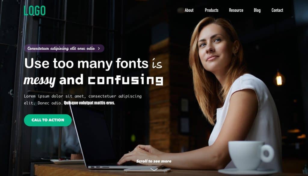

When choosing a title font, it’s important to consider size and weight. A good title font will be bold and large enough to contrast with the body text, and often has the word “display” in its font name. Most (but not all) display fonts are made to be used as titles, and have the power to establish a brand personality and catch attention.
Top Tip
Never use display fonts in body text, as they aren’t designed to be legible when scaled down.
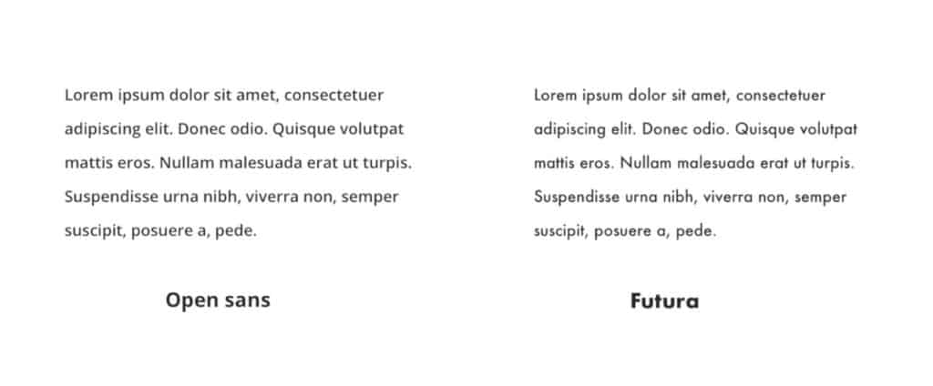
On the other hand, body text fonts should have high legibility even in small sizes. For this reason, they need to have a high “x-height”. In other words, the height of the lowercase letter “x” from that font family needs to be high relative to the font size. Fonts like Roboto and Open Sans have good “x-height” as they were designed to be used for body text on screens, whereas Futura, which was designed for print, is much harder to read in a small size.


Choosing the right font is a big decision, so take the time to try out multiple options and choose wisely! Once you’ve chosen a font, you’ll need to stick to the same ones throughout the entire site for consistency.
3. Avoid static image banners
Static banners with colourful graphics and text are still popular in a lot of websites, particularly e-commerce sites. In spite of this, they’re not actually a good addition to your site for three reasons.
Firstly, they’re not SEO friendly. Search engines can’t detect text in images, so a full-width banner with a heading and subheading embedded in the image will have poorer SEO performance than a page with an H1 tag.
Secondly, static image banners that don’t have consistent graphic design styles inevitably disrupt the visual hierarchy. Using multiple banners that have different font styles, colours and graphic styles on one site can overwhelm your visitors, and even make them leave your site.
Lastly, static image banners aren’t responsive. Because they often date back to before the mobile era, static web banners usually cannot adapt to mobile screen size. In some cases, even if they are scaled down proportionately to fit the mobile viewport, the text will be too small to read.
Streamline your site with these design tips
Cleaning up and tidying aren’t easy – if they were, Marie Kondo wouldn’t have sold millions of books around the world. In fact, designers have a lot to learn from Marie Kondo and her teachings. After all, design is about organising. Providing your users with a clean, visually streamlined experience can help immerse them in your content and keep them coming back for more.
At Yoghurt Digital, our UX team has had the privilege of analysing and improving the websites of clients across a range of industries. Over the years, we’ve found that a key responsibility for designers in the digital world is reorganising and decluttering information and presenting a better user experience.
Ready to start tidying your site? Get in touch with Yoghurt Digital today to see how we can help rid your site of visual clutter.