


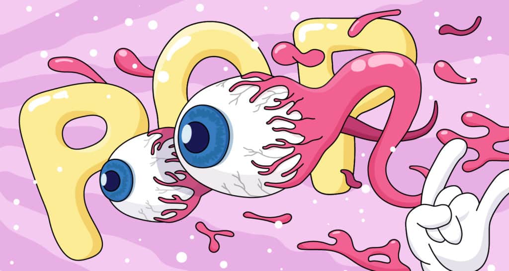


As a designer, there are very few things in this world that can ruin your day more than the seemingly innocent words: “Can you make it pop a bit more?”
This simple sentence, occasionally delivered via client feedback, can be simultaneously enraging, deflating and confusing for even the most experienced of designers – mainly due to its ambiguous nature. But before you cause any grievous harm to your iMac, take a deep breath and try these three design tricks, as they might just help you save your design and recover your confidence.
Demystifying the mystery of “Pop”
Unfortunately, not everyone in the world is an expert in design (although imagine how pretty the world would be if they were!). This means that many people will struggle to give designers clear, specific feedback on a particular design piece. They’ll feel that a design isn’t working, but can’t find the right technical words to explain why. It’s therefore the designer’s job to figure out exactly what isn’t working and how to improve on it.
So, let’s first figure out what “pop” really means. When people say a design doesn’t pop enough, they’re usually trying to say it’s not impactful enough to grab people’s attention. While the reasons behind this can be a combination of different things, a common one is that the design is too flat and lacks depth – or in other words, is missing a sense of z-axis.
Creating the illusion of depth is often the key to bringing greater visual impact and engagement to your designs – but this doesn’t necessarily mean transforming every 2D element into 3D.
So, now that we know what “pop” really means, here are three key tips to help you incorporate a sense of z-axis into your design:
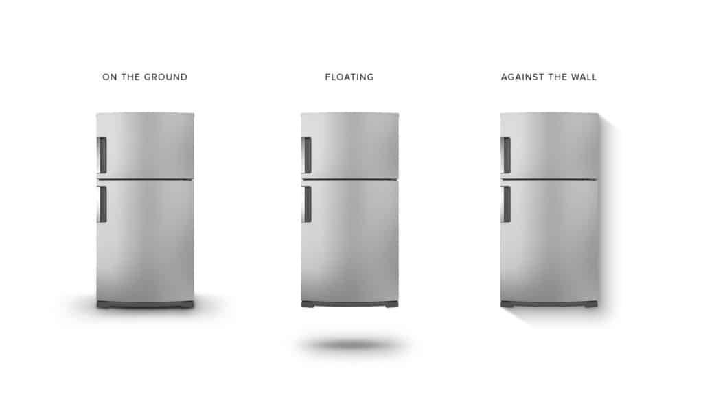
1. Light and shadow are your best friends
With Google’s material design, it’s easier than ever to give a button or card a lovely little drop shadow. It’s a nice touch that gives depth to your design by simulating the physical scene.


Simulating light casting on paper material in the physical world.
By incorporating a hint of light and shadow, designers can create a more pleasing aesthetic that evokes strong emotions of familiarity and empathy in the viewer. Why? Because since the beginning of time, human eyes have made sense of the physical world by subconsciously interpreting the relationship of light and shadow.
There are far more than just one type of shadow you can use, depending on which direction you want the light to come from and how rough the surface is.


Different shadow treatment as the direction of the light source changes.


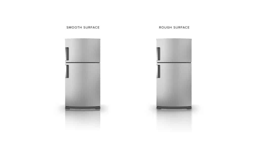
Depending on the roughness of the surface, reflection can have a different treatment.
Here is an example from one of our projects:


This is the header of a landing page we did for one of our clients. We gave the book shadow and reflection treatment and placed it in a Sci-Fi space, which brought more attention and visual impact to the book.
2. Overlay or mask elements for extra pizazz
Another technique to help inject a feeling of depth to your design is to mask or partially overlay certain elements. This creates an illusion of 3D composition – which is nothing new in the traditional graphic design realm, but has only recently been more widely adopted thanks to advances in web development and browser support.
Techniques like this will never be considered overused. If applied subtly and effectively, it will make things “pop out” for you, quite literally!
Here are two examples from some of our own work:


We created an abstract collage combining and overlaying a few elements, including the company logo, to convey a sense of professionalism and reliability.


We purposely misaligned the text and let them blend in with the image. The interaction between the text and image creates a sense of power and motion.
3. Add In Some Perspective
Don’t worry! We’re not suggesting you strictly follow perfect perspective painting methodologies from the Renaissance. You don’t need to draw hundreds of lines disappearing at the vanishing point. Some simple visual hints are enough to imply a sense of z-axis in your design.
For instance, you can make certain elements larger or more saturated in colour so that they appear closer to the viewer. Vice versa, a far-away object would look smaller or faded in colour. You can even blur certain elements to imply the depth of field.


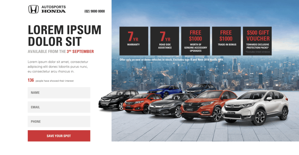
This is the header of a landing page we designed. By varying the size of car images and placing them on a background with natural perspective lines, we created an illusion of depth of field. The composition also leads the viewer’s eyes to the form on the left.


The background with elements of varied size and blurriness extends the composition into a 3D space, which generates more energy and richness. (Source: Dribble)


Tilting or distorting the shapes of certain elements is also an effective way to produce a sense of perspective, which makes the design more vivid and dramatic. (Source: Dribble)
Making It “Pop” On Your Own Terms
These design tips aren’t limited to a particular media – these are tried and true techniques that have been successfully adopted across a range of design disciplines, from graphic design to painting. No matter what you’re designing, be it a flyer, a poster, a web banner, a web page or presentation slides, you can always bring your design to another level by adding some extra depth.
And that’s it! Next time someone says “can you make it pop?”, you know what to do. Your client – and your blood pressure – will thank you for it.
If you’re interested in taking your digital designs and user experience to the next level, get in touch with the experienced team at Yoghurt Digital today.