What’s the most common blocker on the conversion journey? When it comes to specialised content and ecommerce websites, the answer is often right in front of you – but not in front of your customers. And that’s where the problem lies: The level of difficulty in finding content or products on your website, otherwise known as “information architecture” (IA).
Today’s users are more impatient than ever. Around 50% of visitors are likely to leave your website if they can’t find what they’re looking for in the first eight seconds. Unintuitive navigation, confusing content groupings and naming conventions can play a significant role in hindering the user experience and damaging your conversion rates.
To help you avoid the pitfalls of poor information architecture, here’s a rundown on what it is, how it affects your customer journey, and the steps you can take to improve it.
What is information architecture?
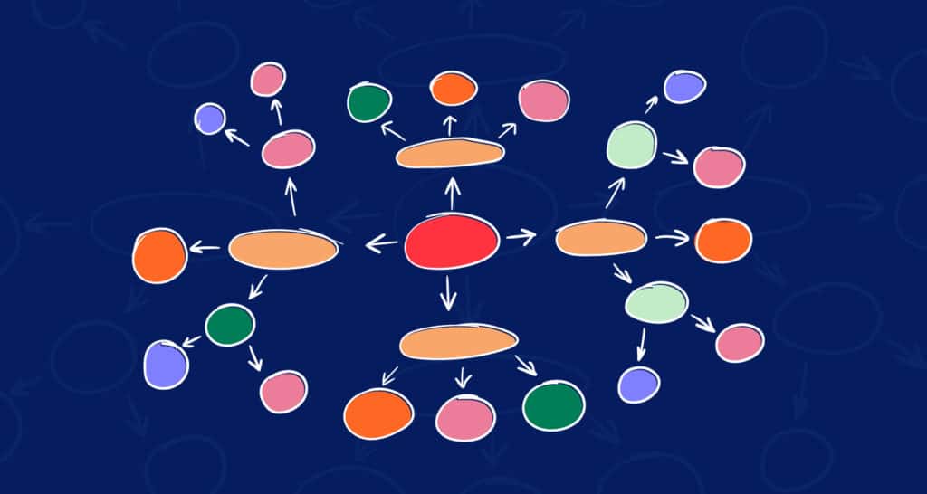
In its simplest form, information architecture (IA) is how different pieces of content or products are labelled and organised – and how this all fits together on a website.
Good IA is intuitive, helping users to complete their goals on your website quickly, efficiently, and without friction, which ultimately results in happier customers and higher conversion rates.
On the other hand, IA failures are costly to a business: 10% of all task failures on a website are due to bad IA. The good news? Improving your IA will grow your task success rate and general business by more than 10%. Some sources suggest that the return on investment of investing in IA improvements is a more than 80% jump in business metrics.
Why is bad IA… so bad?
It’s very likely that you built your website with good intentions. After all, no one ever intends to create a monster labyrinth of never-ending pain for their customers. But many websites are built upon the business’ understanding of navigation structure and labelling, and what’s clear to a group of stakeholders who are immersed in their products day-in and day-out will rarely be as clear to the consumers.
Poor IA makes it difficult for users to navigate through your website, engage with your content, or find the products they’re searching for – and consumers cannot buy what they cannot find. 85% of shoppers abandon a website due to poor design, while 83% leave because it takes too many clicks to get to where they want to go. Current data puts the average bounce rate of ecommerce stores at nearly 46%.
Seek and thou may or may not find ¯\_(ツ)_/¯
To understand how poor IA could affect your users, consider this example: You’re looking for a pair of tongs in your friends’ kitchen drawers. You think of tongs as a utensil, so you expect to find them in the utensil drawer with the spatulas, stirring spoons, and whisks. But in this house, the tongs are located in the cutlery drawer, along with the forks and spoons (madness, I know). In the time it takes you to find the tongs, the pot on the stove is bubbling over, the roast is burning, and the oven timer is shrieking. In short: chaos.
This is how your users might be feeling on your website.
In this age of customer-centred design, customer needs should be considered from the start. While IA isn’t really visible to end-users, navigation and visual design are built based on your information architecture, and according to Adobe, 38% of online shoppers will leave a website if they find the content, design or layout to be unattractive.
That’s why understanding your target customers, their preferences, language, and browsing behaviours is key to the success of any website.
Enter: card sorting.
What is card sorting?
Card sorting is a tried and tested user research method to understand and improve a website’s IA in harmony with users’ mental models. It’s a reliable and effective way of bridging the gap between the user and business’ points of view of how things should be labelled and connected on a website.
It’s a gamified exercise where users actively participate in solving the problems of navigation, grouping and labelling / naming conventions. In preparation for a card sorting session, each piece of content or product on a website is written down onto cards or post-it notes, which participants are then asked to group in a way that makes sense to them.
Now is where it gets interesting. Card sorting can be conducted in a few different ways:
Open card sorting
Here, users generate the labels for the groups they created. The labels generated may not be the exact category label you should implement, but it provides an idea about what terminology makes sense to users and which products they see as connected.
Closed card sorting
Alternatively, card sorting can be conducted in an evaluative way where new products or content are introduced to the site to determine what category users place these within the existing structure. Users are asked to place items under predetermined category labels given to them.
In-person card sorting
My preferred method is in-person card sorting, where we ask users to think out loud while they’re sorting products, so we can witness their logic, pain points and products they find particularly challenging.
Card sorting can also be completed remotely via online tools like Optimal Workshop. The downside of online methods, however, is that they’re unmoderated and the insights gathered are not as deep as those from in-person sessions.
How to use card sorting insights
The ultimate goal of card sorting is to understand:
- If the existing information architecture is optimal.
- How information and products should be grouped according to users’ mental models.
- What these groups should be named.
- What navigation structure would be intuitive to users.
The analysis and outcomes of card sorting
The results of card sorting can provide a wealth of valuable insights useful for improving a website’s information architecture, user experience, and conversion rates.
When analysing the results, look for common groupings, category names or themes, along with items users were most cautious and confused about. At Yoghurt, we present these findings to clients with an updated sitemap, content structure and a list of recommendations – all ready for implementation.
Helping your customers convert
Information architecture forms the backbone of usability and conversions. By understanding your user through methods like card sorting and refining the information architecture of your site to reflect those insights, you’ll ensure a great user experience. In turn, this will lead to happier customers and great conversion rates.
If you’d like to learn more about this, or would like some expert help with improving your information architecture and user experience, get in touch with our Conversion Rate Optimisation specialists at Yoghurt Digital today!