


There has been a great deal of discussion surrounding Google’s new mobile design for the search engine results page (SERP), which was officially introduced last month as part of an ongoing effort to improve the search experience for users.
As an agency we always strive to keep you informed with the latest updates and insights into the digital marketing landscape, and in this article we’ll briefly talk about the changes Google have made to the mobile search page and how you can take advantage of this opportunity to increase your brand exposure. You’ll be surprised by how much difference a small design tweak can make.
What’s Changed?
So, what exactly has Google changed? Our news feeds are mostly inundated with articles of this nature (because we’re digital nerds), but in case you’re not as nerdy as us, we’ve put together a summary of the new mobile SERP design announcement:
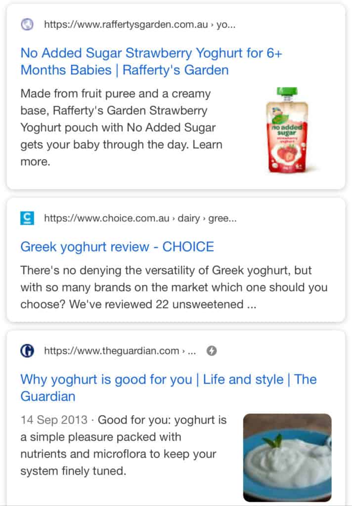
- Google has officially adopted a new “Ad” label for paid search results, which it’s been testing for a while now.
- This has replaced the green “Ad” badge with a black and bold text label, which appears at the same location as the favicon for organic search. Some argue that this makes it even harder for users to tell the difference between paid ads and organic results since they are only distinguishable by a small icon. However, in our opinion, it does feel easier to scan an icon than looking for a tiny green outlined badge among other congested text. It’s just a matter of whether people realise that the bold black “Ad” is a label for a paid ad instead of a particular company’s logo.
- The website name and bread crumbs have been moved above the link itself, next to the favicon.
- The horizontal line breaking the title and content has been removed to unify the listing’s design.
Here’s a ‘before and after’ view of the changes:


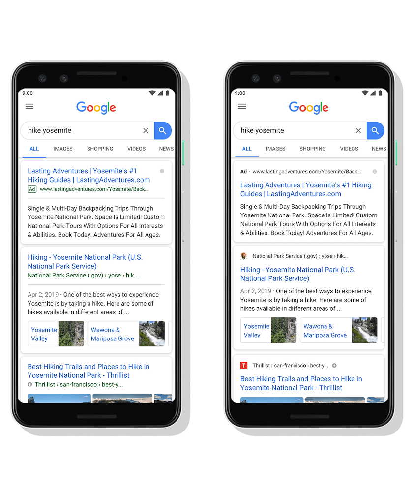
- For organic search results, a favicon is now visible in the upper left corner of each search result as a visual anchor (which isn’t anything new if you’ve been using DuckDuckGo.com).


These changes have been introduced to mobile first, but a roll-out across desktop and tablet devices isn’t far behind.
Why Should We Care?
According to Google, the goal of the design was to provide more efficient user experience by allowing people to find the right type of information more easily – particularly as the modern web continues to be enriched by a large variety of content, including images, videos and even 3D assets.
These updates on the SERP are only small steps in Google’s broader plan to unify its design system and diversify its UI modules. The goal is to gain the flexibility to accommodate different types of content and display more actions and previews, allowing users to find information and take actions without having to click into a website.
What Should We Do?
Despite the small size of the favicon, the tiny little 16×16 pixel icon has now become the hero representing your brand on Google’s results page, serving as the only visual branding element that sets you apart from your competitors. That means having a properly designed favicon has never been so important, since search results with a recognisable favicon will be perceived as having greater credibility and trust.


Google will show a default globe icon for websites without an assigned favicon.
Google has provided a guide on how to setup the favicon to display on organic listings, but it doesn’t tell you how to optimise the icon design itself.
Here are some tips from us to help you create a more effective favicon:
1. Design In Small Sizes
Since the end product is going to be tiny, create your favicon on a small-size canvas (64x64px or 32x32px) with pixel view, so that you can see what it will actually look like. Avoid scaling down larger artwork, as it’s likely to become blurry and illegible – especially for logos with straight, sharp edges.
2. White Space Is Your Enemy
This is one of the rare exceptions that you need to turn against your lovely friend, the white space. When it comes to favicon design, you’ll need to maximise the size of the graphic within the background as much as possible for legibility, while also making sure the background and the graphic have enough colour contrast.
3. Keep It Simple
The icon design needs to be extremely simple in order to make it recognisable. If your logo is a word, consider making it a letter. If it’s a complex shape, think about creating a simpler version of that shape in a smaller size.
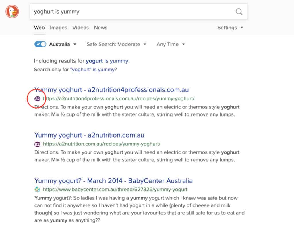
Here’s a ‘before and after’ example of how we updated the Yoghurt Digital favicon:


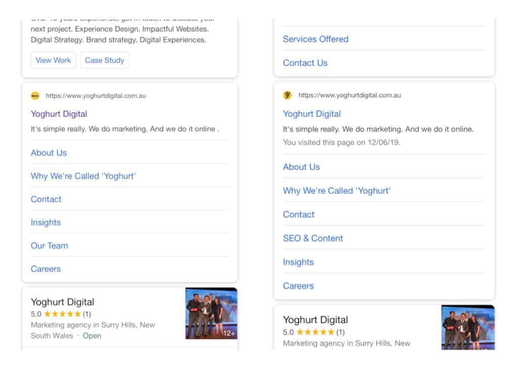
The previous Yoghurt favicon was too cramped to be legible, so we took the letter “y” as the icon and made it thinner to improve clarity.
Now it’s your turn to optimise your favicon and make sure your branding stands out among the other organic listings on Google’s search page!
Let’s Talk
Think you might be impacted by a Google update? Don’t panic! Get in touch to learn how we can help.